
SBB Selbstschutz APP
Designing a mobile application to support track workers and related staff in planning and documenting safe track walks and work. These safety procedures are required by regulations, yet until now they were carried out using physical checklists. The goal was to create a digital solution that simplifies compliance, improves usability, digitalize processes and better supports workers in their daily environment.
role
UX architect
approach
User Centered Design, collaborative approach
tools
Figma, Miro, Confluence, Jira
Discovery & Research
The project began with on-site research, including interviews and direct exchanges with track workers and stakeholders. Observing real working conditions was essential to understand how safety processes are actually carried out in practice. It became clear that while the processes themselves were well understood, the existing tools did not support them effectively. Documentation in particular was often perceived as a burden rather than a meaningful part of the workflow.
Co-Creation & Strategy
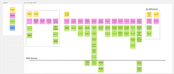
To align all stakeholders and define a clear product direction, I planned and facilitated a series of collaborative workshops. Together with the Product Owner and Business Analyst, we created a user story map that helped structure the overall process and identify priorities. Based on this, we defined the MVP and outlined additional features for future releases.
This shared overview created transparency and ensured that everyone involved had a common understanding of both immediate goals and long-term vision.

Ideation & Concept Development
Building on this foundation, I guided the team through several ideation iterations using the Design Studio method. Participants first sketched individual solutions, which were then discussed and combined into stronger concepts. This process not only produced initial screen ideas but, more importantly, clarified the user flow derived from the user story map. After three workshops, I had gathered enough input and domain knowledge to consolidate the ideas into a coherent UX concept and develop a prototype for testing.

Prototyping & Testing
The prototype was tested directly on-site with track workers in real working conditions. In total, 6 to 8 usability tests were conducted across 5 iterations. After the second round, the insights began to stabilize and only minimal new findings emerged. At this stage, I advised the Product Owner to move forward with development and shift learning into the live environment, where real usage would provide more valuable insights than further testing in simulated scenarios.

Agile Development
During the agile development phase, I continued to support the team by clarifying UX questions, refining interaction details, and designing edge cases. At the same time, additional feedback from safety and quality departments was incorporated, leading to smaller adjustments and extensions of the product.
Outcome
Through this highly collaborative and iterative approach, the project reached its first usable release within nine months, which is notably fast for a project of this scale in a large organization. The resulting application successfully replaced the paper-based process, improved clarity in safety procedures, and enabled more structured and traceable documentation.
Learnings
One of the key learnings from this project was recognizing when further usability testing no longer adds significant value. At a certain point, real insights can only be gained from actual product usage in real contexts. Another important factor was starting backend preparations during the testing phase, which helped save time and accelerate the overall process. Additionally, the project highlighted the challenge of balancing stakeholder requirements, particularly when legal and safety departments pushed for more content within the app.
From a UX perspective, this often led to the opposite of the intended effect, as users tend to ignore overly dense information. Instead of increasing text, I focused on improving navigation, structuring content more clearly, and guiding users through better component placement. This ensured that critical information was effectively communicated and reduced the risk of user errors.